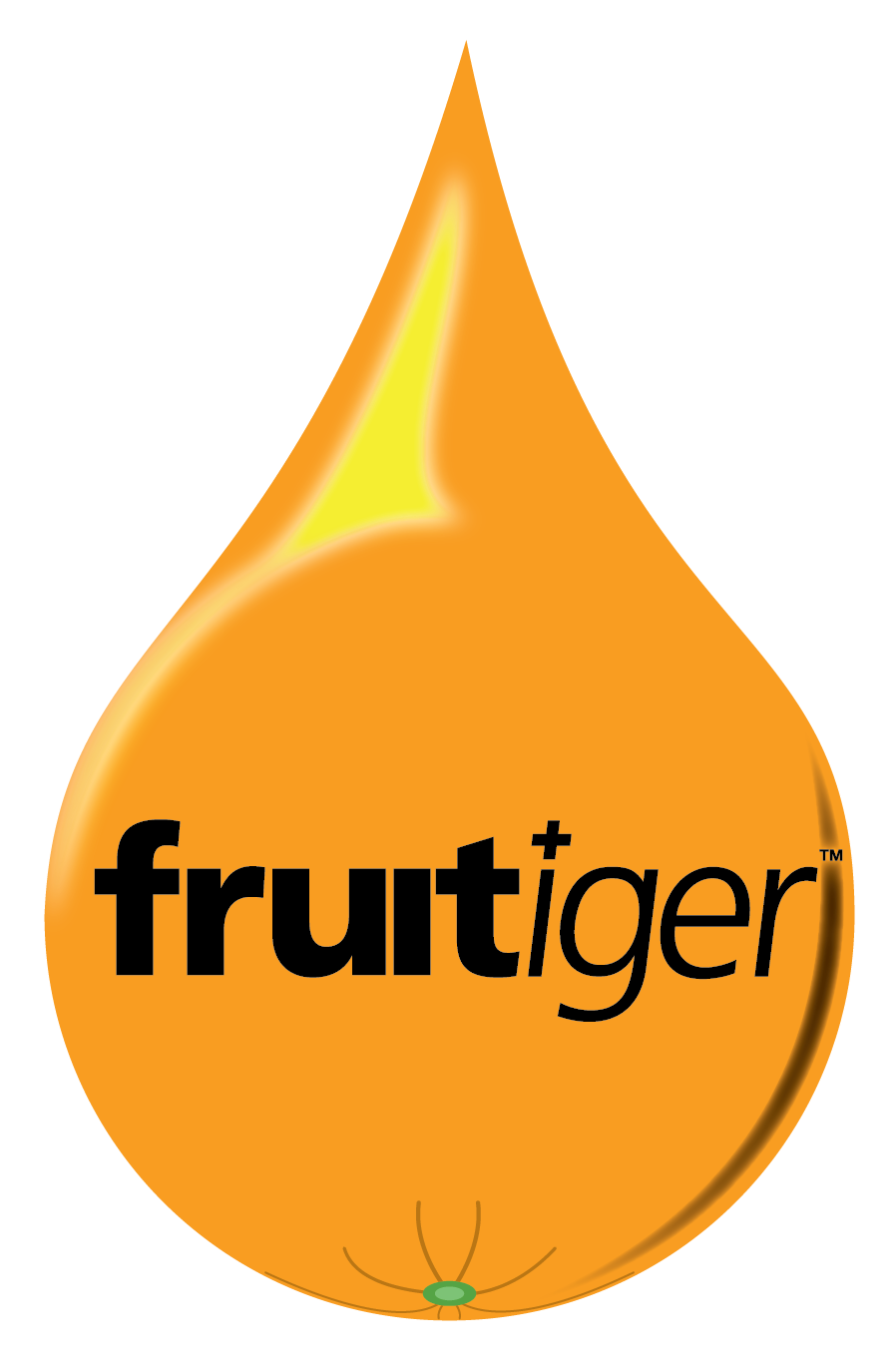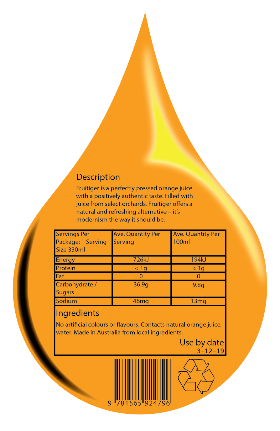
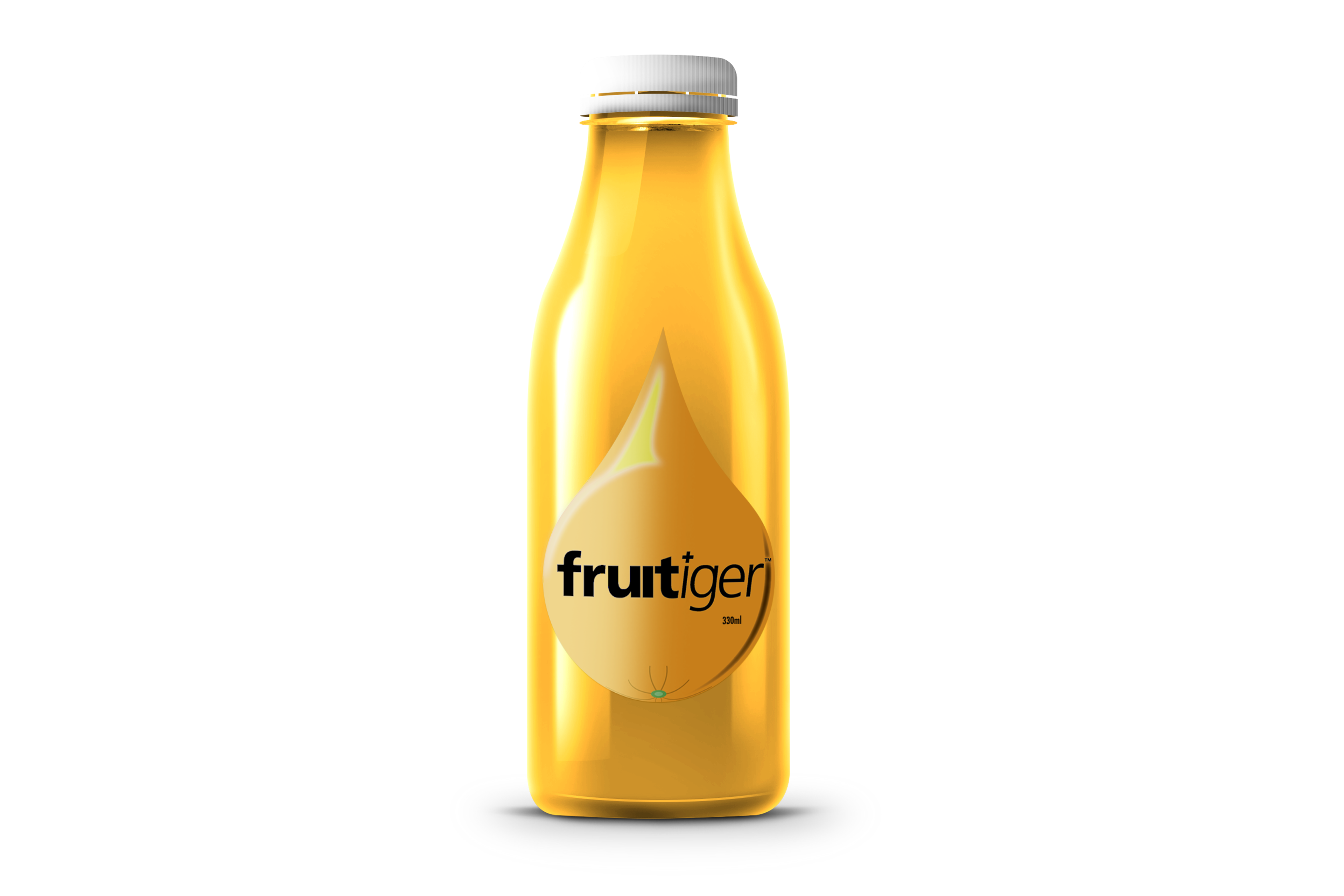
In the same term and class, but after finishing the brochure, I designed a bottle label for a bottle of Orange Juice that, if it were to be printed, it’d be printed on a transparent sticker or printed straight onto the bottle itself. I studied how light reacts and reflects to a water droplet and stylised it, using that study in the basis of the design, giving the 2D image a third dimension. I added a little curved strip of shadow on the opposite side of the drop. I wanted the droplet to look like a drop of orange juice, but then I took that idea further by putting a bit of green for the stem of the orange, and some shadow from folds in the skin at the stem. If I were do this again, I’d use Photoshop to create a bitmap, take it into illustrator, trace the image and separate the black from the white and curve the dots over the skin of the orange and drop the opacity to give it some texture and more shape. I might’ve even extended the curved bitmap up and over the top of the droplet for more shape. When it came time to mock it label onto the photo of the bottle that was shared around the class by the teacher, I it just happened that the light in the image was on the same side as the light on my label, I didn’t plan that or change anything so it’d fit.