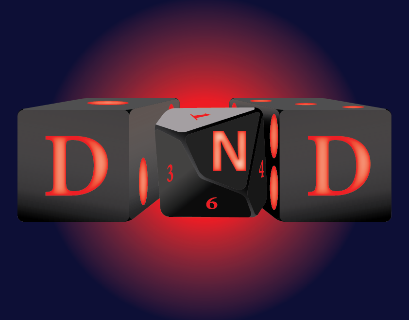
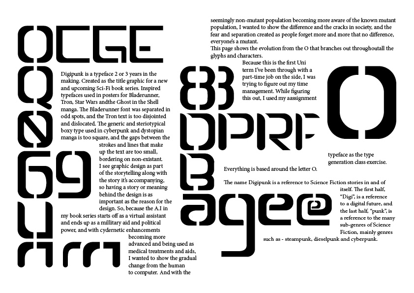
There were 2 complete typefaces I designed in my first term of my Bachelor. Their names are “Digipunk” and “Decopunk”, two typefaces that were designed to be 2 sides of the same thought. They were designed to be sci-fi typefaces that were meant to be used in my book series
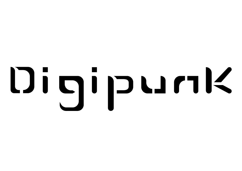

Digipunk was the final choice for its initial purpose, but either can be used for any future project. Other than being a graphic designer, I’m also an Author of a Sci-Fi E-Book series that is set at the end of the 23rd century and the start of the 24th. The series is about racial and disability discrimination against people who stand out in a world of people who are all the same. Along with this, the technology we use slowly progresses, and the Siri or Alexa type personal A.I. assistant, A.I. automating everything in this future, and grows into governmental power and practically rules the world with the initial intention of being able to do something that no human could do. Bring peace through consistency rather than a committee of representatives from the countries of the world who never agree on anything. Because the A.I. is around the world, it can see everything and implement anything without a council of disagreeing members.
I wanted to show the automation and the restrictiveness of the A.I. that runs the world through the square based letters, the limited kerning and tracking, and the clear, yet optically unpleasing lack of over-shoots
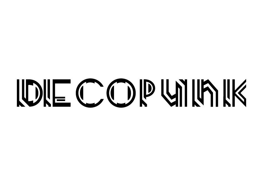

I wanted Decopunk to show the complexity of a computer through making the Art Deco inspired typeface resemble circuitry.
This typeface wasn’t designed to have any lower-case letter-forms, but when it came time to design the U and N, the upper-case forms just didn’t look like the letters they were meant to be. It does have Over-shoots and does allow for dynamic kerning and tracking.