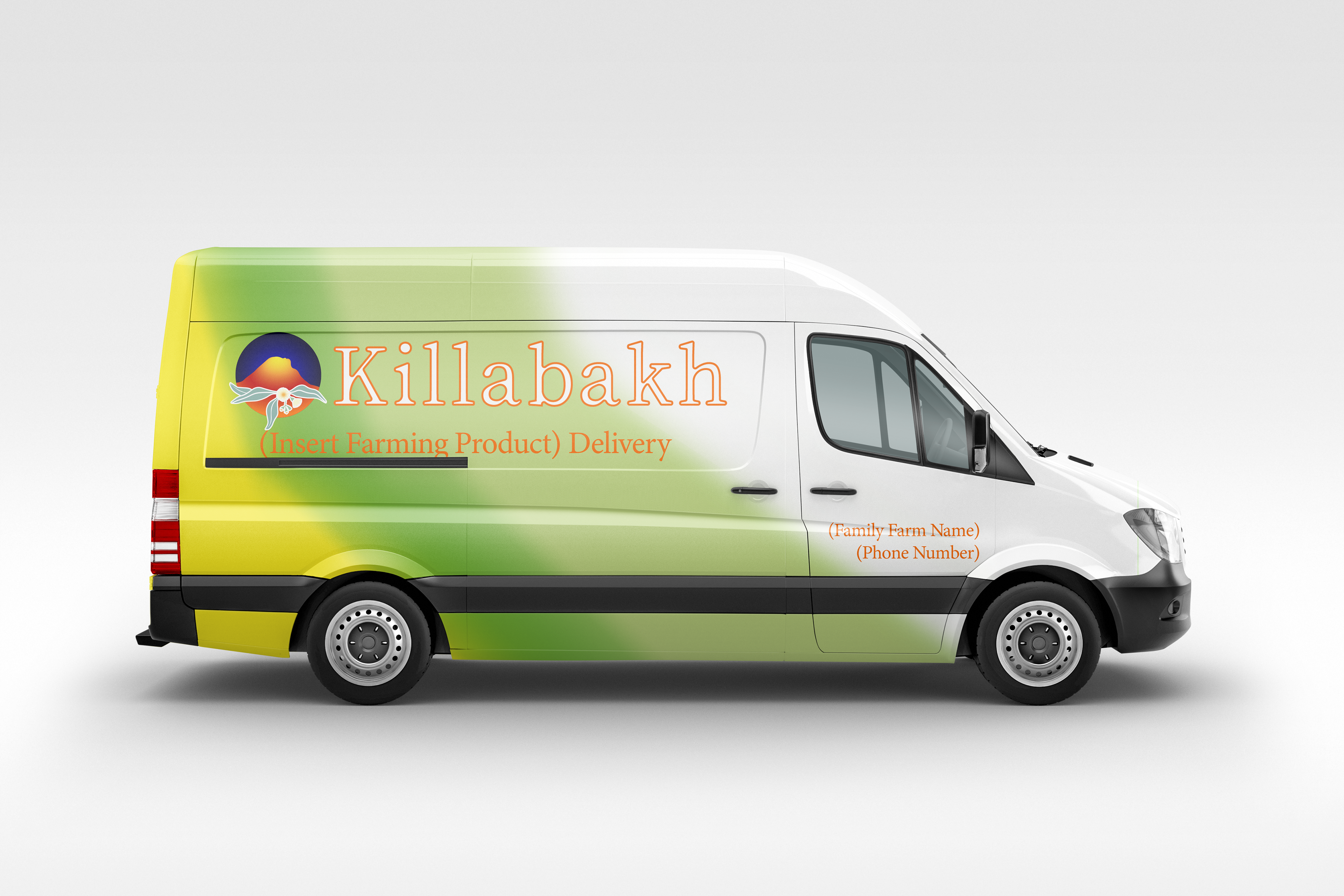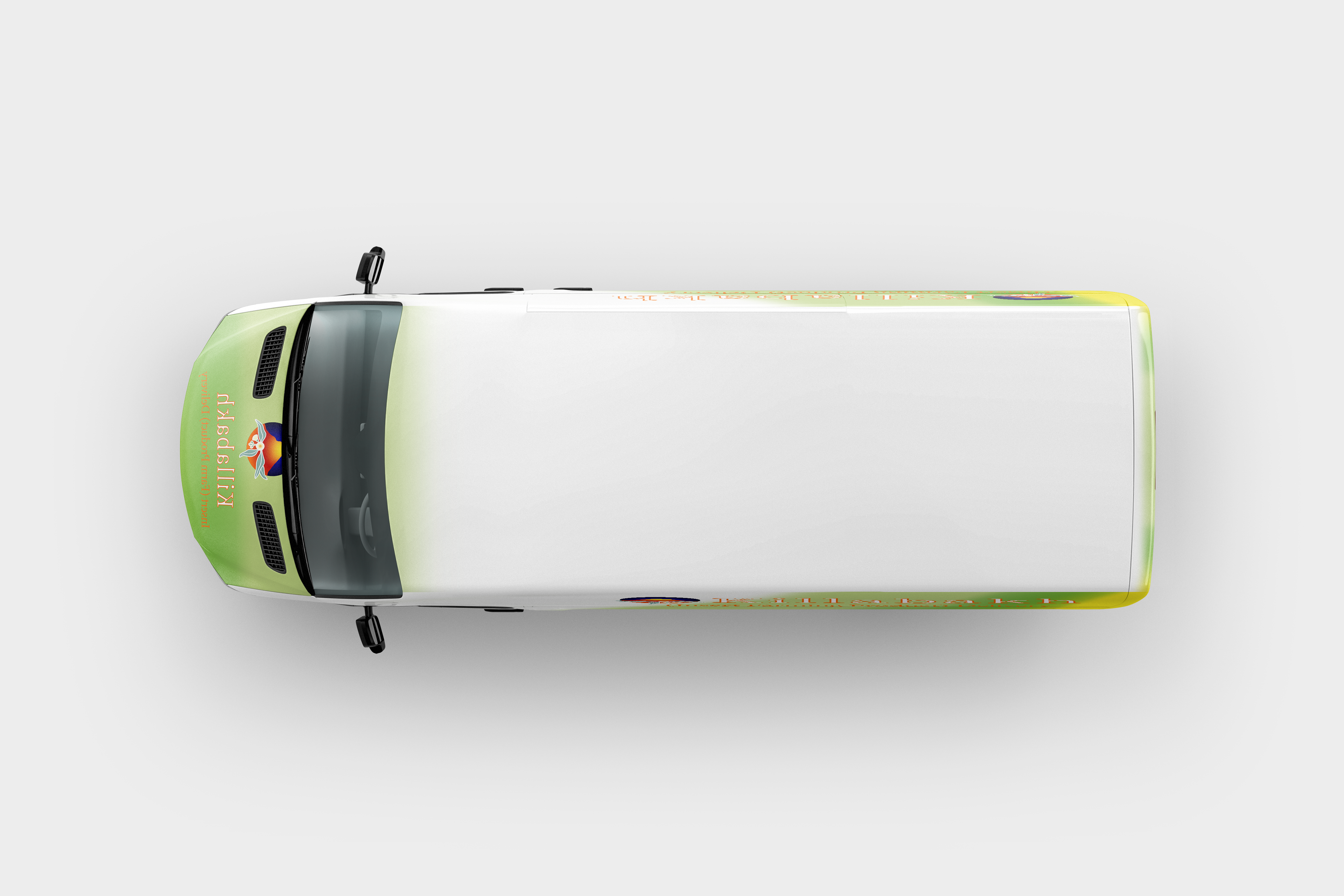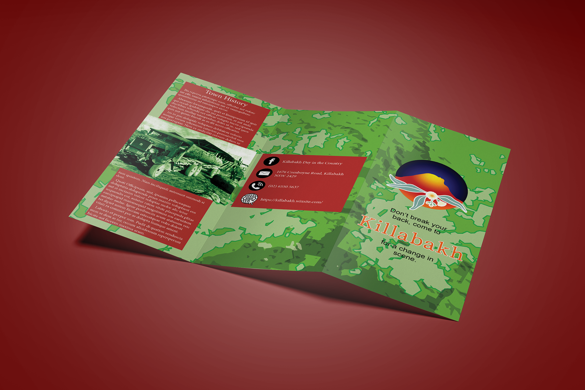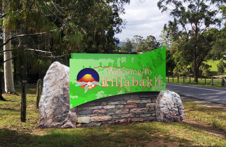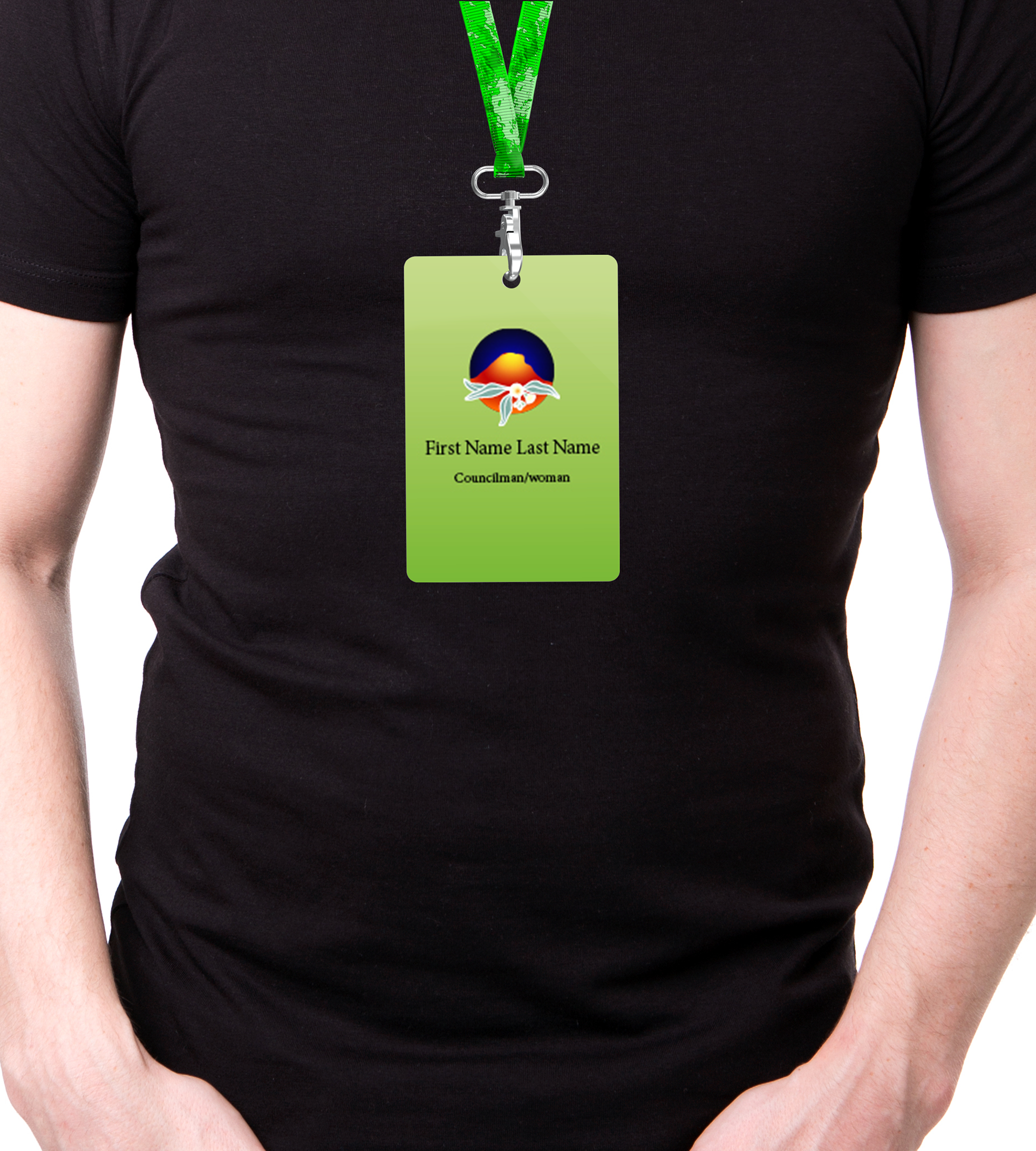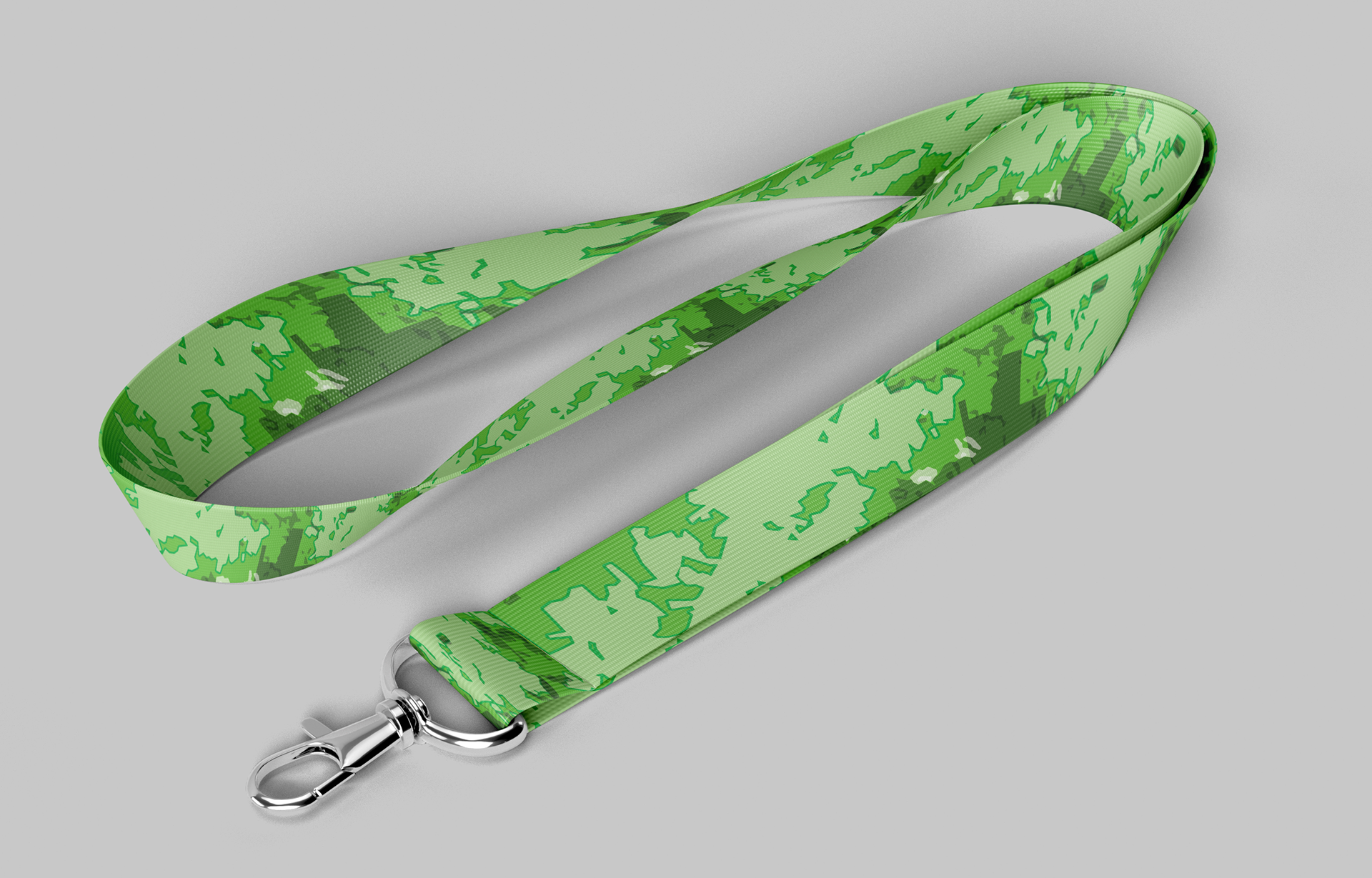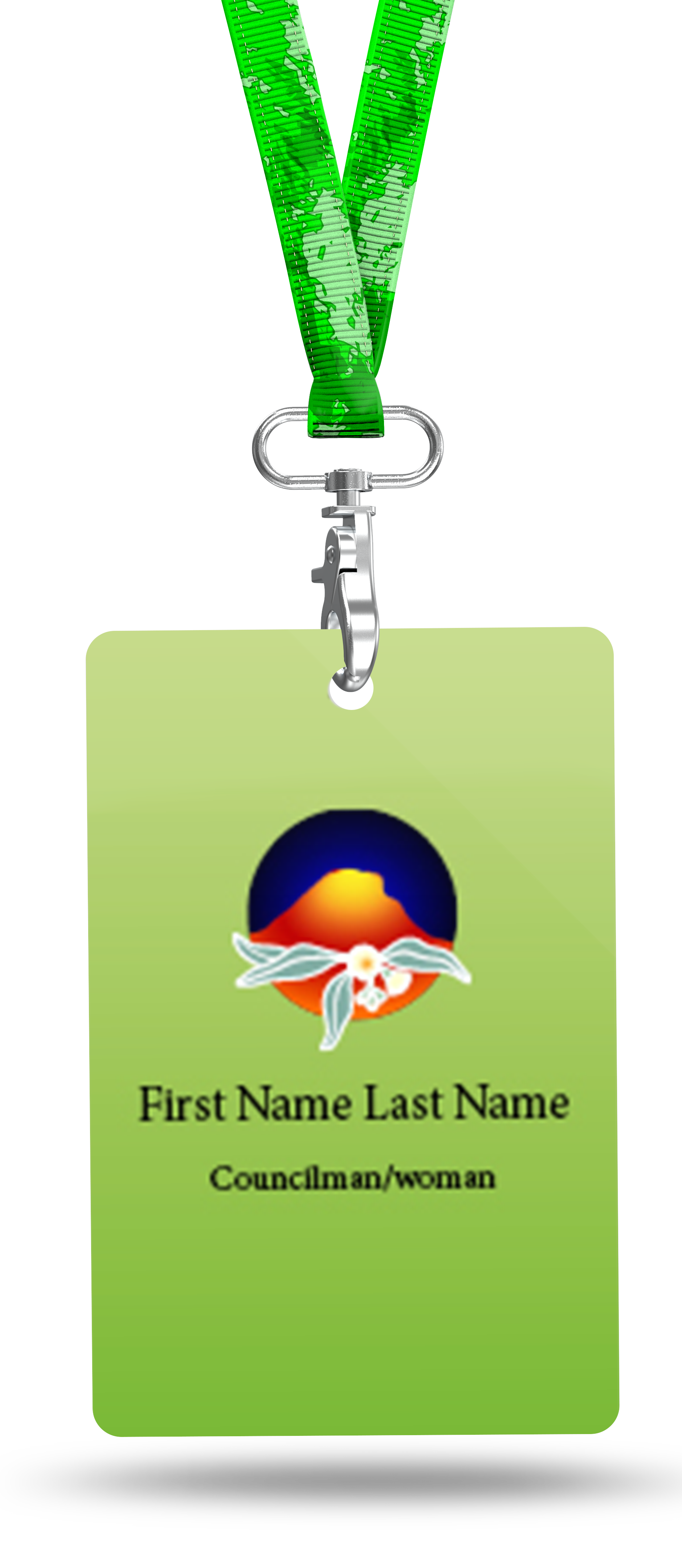

In the forth term of my Bachelor, I worked on the welcome sign for a rural town in Sydney’s north west. As an addition to the welcome sign, I designed the branding for the farming town, including refreshing the town logo, designing vehicle wrapping for farm produce delivery, tourist brochure, council member uniform pieces such as the tag and necklace to a lanyard and name badge. I was given the existing logo, but I was meant to redesign it, but found that, in the process of redesigning, I was refreshing it without knowing until I saw the original. I designed a pattern for the brochure and welcome sign based on a bird-eye-siew of the Killabakh area from Google Maps and used the colours I chose as background gradients for the badges, vehicle wraps and lanyards. While I based the pattern off of the Google Maps image of the Killabakh Area, the shape of the welcome sign was inspired by the Dolby town welcome sign.